
Introduction to Graphical User Interfaces
In this lesson, we'll learn the basics of programming graphical user interfaces (GUIs). GUI-based programs are somewhat different from those you have written so far. You're earlier programs have driven the process of user interaction. When the programs wanted data they prompted the user, and waited for the user to complete their entry by pressing Enter.
Consider a program with an interface that has buttons, checkboxes, text entry items, and so on. The user can interact with these elements however they like. But how do we write programs that are ready to respond to whatever the user presents?
Take a look at the diagram below. The user sees some sort of desktop wallpaper (in this case, an image of the moon) covered with icons, application windows, and (since the desktop is that of a Windows XP machine) the taskbar that holds icons representing each running application, a whole load of quick-launch icons, and a Start icon that can be used to bring up a menu allowing access to most of the facilities of the computer.
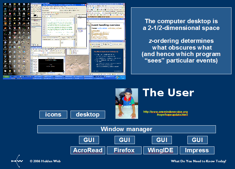
The desktop is called a "two-and-a-half dimensional" surface because, although it does not actually have a third dimension (depth), one window can cover another, just as though it were a piece of paper covering another piece on a real, physical desktop. (Sadly, my own physical and virtual desktops are rarely tidy!) When you click on something, the window manager must know which window is on top where you have clicked, so it can channel the event to that window.
In a GUI environment, you write programs that present a description of the desired window structures to the window manager, which is the system component that handles (among other things) tracking mouse movements and distributing keystrokes and mouse clicks to the right programs. Which programs receive these events depends on a number of factors, including the current cursor position and which window has the focus.
Each window is composed of widgets, some of which contain other widgets, and so on. One widget can be positioned on top of another. The window manager has to make the determination about which widget is uppermost at the particular position of the cursor when the click occurs. (We'll go over widgets a bit more later in the lesson.)
All this information is created in a form that the window manager can understand by making calls to a window library. The main libraries in Python are PyQT, wxPython, and tkinter. We'll use tkinter to explain the principles of working with GUIs. The descriptions of the window structures include references to the specific pieces of code (event handlers) that must be run in response to specific events.
The structures can be modified while the program runs. For example, you can arrange for a dialog box to appear when a particular button is clicked. While a program's main window is usually created at the start of the program and continues to exist for the duration of the program, it is not at all uncommon for programs to create and delete other windows as they are required.
This example is taken straight from the documentation for the tkinter module. The program creates a window that looks like this:
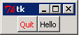
When you click the button on the right, the program prints some text on its standard output. When you click the button on the left, the program terminates. Create a tkdemo.py file as shown:
from tkinter import *

class Application(Frame):

    def say_hi(self):
        print("Hi there, everyone!")

    def createWidgets(self):
        self.QUIT = Button(self)
        self.QUIT["text"] = "Quit"
        self.QUIT["fg"]   = "red"
        self.QUIT["command"] =  self.quit
        self.QUIT.pack({"side": "left"})

        self.hi_there = Button(self)
        self.hi_there["text"] = "Hello",
        self.hi_there["command"] = self.say_hi
        self.hi_there.pack({"side": "left"})

    def __init__(self, master=None):
        Frame.__init__(self, master)
        self.pack()
        self.createWidgets()

root = Tk()
app = Application(master=root)
app.mainloop()
Run it. Click the Hello button and then the Quit button, to see what they do.
Let's look at the code more closely:
from tkinter import *

class Application(Frame):
    def say_hi(self):
        print("Hi there, everyone!")

    def createWidgets(self):
        self.QUIT = Button(self)
        self.QUIT["text"] = "Quit"
        self.QUIT["fg"]   = "red"
        self.QUIT["command"] =  self.quit
        self.QUIT.pack({"side": "left"})

        self.hi_there = Button(self)
        self.hi_there["text"] = "Hello",
        self.hi_there["command"] = self.say_hi
        self.hi_there.pack({"side": "left"})

    def __init__(self, master=None):
        Frame.__init__(self, master)
        self.pack()
        self.createWidgets()

root = Tk()
app = Application(master=root)
app.mainloop()
The majority of the code in the program defines a class named Application, which subclasses the tkinter.Frame class. The tkinter.Frame class defines all of the general behaviors required of a program's GUI, but these general behaviors do not encompass the specifics of the contents of this window. For those specifics, we have the createWidgets() method.
Let's begin by looking at the tkinter.Frame class's __init__() method. First, it performs all of the standard tkinter.Frame initialization actions by calling its superclass's (tkinter.Frame's __init__()) method. Next, it calls the newly created frame's pack() method, which prepares it to be part of the window display. Then, it calls the createWidgets() method, which as its name suggests, creates the widgets (or components) that go inside of it.
createWidgets() initializes only two widgets: the first is the Quit button, which reads "Quit" with the foreground ("fg") text in "red" and calls the Frame's self.quit() method (inherited from tkinter.Frame) when clicked; the second is the hi_there button, which reads "Hello" and calls the Frame's say_hi() method when clicked.
| Note | Hey, wait a minute. In the Python 1 course, didn't we say that we should never use the from module import * form of the import statement? In fact we did. But certain modules have been designed specifically to be used in this way. If tkinter were used in the standard form, then our code would be more difficult to read. When writing a typical program, we use many names from tkinter. Our code readability is enhanced by limiting the use of qualified names such as tkinter.Tk. The tkinter module has been designed with that in mind, and although there is always some danger that you might unknowingly overwrite one of the 150+ names it defines, in practice this doesn't happen much. |
Now, suppose the customer changed the specification for this project. They want to change the colors and text a bit to make the application to look like this:
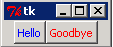
The changes include:
- Change the "QUIT" button label to "Goodbye."
- Make the "Hello" label blue.
- Move the "Goodbye" button to the right of the "Hello" button.
Try to make the changes without looking at the answers below.
. . .
Try to figure it out on your own first!
. . .
I mean it!
. . .
Don't peek!
. . .
If everything went alright, your changes look something like
those in the box below (additions and changes in this color and deletions
in this style):
from tkinter import *

class Application(Frame):

    def say_hi(self):
        print("Hi there, everyone!")

    def createWidgets(self):
        self.hi_there = Button(self)
        self.hi_there["text"] = "Hello",
        self.hi_there["fg"]   = "blue"
        self.hi_there["command"] = self.say_hi
        self.hi_there.pack({"side": "left"})

        self.QUIT = Button(self)
        self.QUIT["text"] = "QuitGoodbye"
        self.QUIT["fg"]   = "red"
        self.QUIT["command"] =  self.quit
        self.QUIT.pack({"side": "left"})

        self.hi_there = Button(self)
        self.hi_there["text"] = "Hello",
        self.hi_there["command"] = self.say_hi
        self.hi_there.pack({"side": "left"})


    def __init__(self, master=None):
        Frame.__init__(self, master)
        self.pack()
        self.createWidgets()

root = Tk()
app = Application(master=root)
app.mainloop()
The createWidgets() method creates precisely two widgets, which it stores as the instance attributes QUIT and hi_there. Button is a function defined by the tkinter module. When called, it requires the parent widget to be provided as the first argument. Since the newly created frame instance (the one whose __init__() method is being called) is the parent, self is provided as the first argument. This makes the Application instance the parent of the button.
Once the QUIT widget has been created, the method then sets a number of configuration items. Each of these items has a name and a value:
| Item name | Meaning |
|---|---|
| text | The label to be shown inside the button |
| fg | The foreground color used to write inside the button (that is, the color in which the text label will be written) |
| command | The function to call when the button is clicked |
The text and fg configuration items are pretty straightforward. The command item takes a little more effort. This particular code is written to allow the creation of multiple windows, each being an instance of the Application class. Because the command item is an instance method, when the QUIT button is clicked on an instance of the Application class, that instance's quit() method is called. This method is inherited from the tkinter.Frame class, and causes the application to terminate.
Once the widget is fully configured, its pack() method is called to place it at the left-hand side of the (containing) application window (other options are "right", "top," and "bottom). That concludes the configuration of the QUIT button. Next, a second widget (the hi_there button) is created and configured to call the hi_there method when it's clicked. This button is then packed to the left of the remaining space in the containing window.
The only other method in the class is say_hi(), which is the event handler for clicks on the hi_there button. It prints a message on the console whenever it's called by the user.
Once the Application class is defined, the program needs to create an instance of the application class and pass control to the window manager. The code for that immediately follows the class definition.
The first line, root = Tk(), creates the application's main window. If the application created any other windows, they would be children (or grandchildren) of root. The next line, app = Application(master=root), creates an instance of the application class (as a subclass of tkinter.Frame) and attaches it to the root window.
The call to the application's mainloop() method (which is inherited from tkinter.Frame) hands control over to the window manager. This method only returns when the application is terminating—the window manager makes direct calls to the event handlers when specific events that have been programmed into the window description occur. Once the application terminates, the program calls its root window's destroy() method to release any window manager resources before the program ends.
So, when you run the program, you see a window like this:
The layout of the components was created by calls to the various components' pack() methods. Every time you click the "Hello" button, the program will print "Hi there, everyone!" in the console window. When you click the "Goodbye" button (or terminate the program by clicking the "X" button at the top right of the window) the program terminates.
So, there you have it. You have written and run your first GUI program using Python's tkinter package! Good for you!
| Note | By the way, you may be wondering what tkinter means: tk stands for tool kit, and inter stands for interface. |
The word "widget" is often used as an abstract name for an object, most often for something manufactured. Modern GUI toolkits, tkinter included, are comprised of components that are referred to as "widgets." All Tkinter widgets have a lot in common, even though they may not look alike.
There aren't a whole lot of widgets in the Tkinter toolkit, but using them wisely will allow you to create a variety of useful graphical interfaces. Below are some important ones that you should know about now:
| Widget Type | Purpose |
|---|---|
| Frame | A container for other widgets. You can set the border and background color, and place other widgets inside of it. |
| Toplevel | A special kind of Frame that interacts directly with the windows manager. Toplevels will usually have a title bar, and features to interact with the window manager. The windows you see on your screen are mostly top-level windows, and your application can create additional Toplevel windows if it is set to do that. |
| Button | Users click on buttons to trigger some action. As you already know from the sample program you just entered and ran, clicks on the button can be translated into actions taken by your program (this is actually true of many widgets). Buttons usually have text inside of them, but they can also show graphics. |
| Checkbutton | A special type of button that has two states; clicking change the state of the button from one to the other. |
| Label | Labels are used to display pieces of text or images, usually ones that won't change during the execution of the application. |
| Entry | Used to enter single lines of text and all kinds of input. |
| Listbox | Used to display a set of choices. The user can select a single item or multiple items from the list. The Listbox can also be rendered as a set of radio buttons or checkboxes. |
| Scale | Lets the user set numerical values by dragging a slider. |
| Text | A multi-line formatted text widget, it allows the textual content to be "rich." It may also contain embedded images and Frames. |
| Message | Similar to a Text, but can automatically wrap text to a particular width, or width and height. |
| Menu | This is the base widget that you use to put a menu in your window (not all programs need one). It corresponds to the menu bar along the top of your program window, and can also be used to implement "popup" or "context" menus. |
| Menubutton | Adds choices to your Menus. |
| Radiobutton | Represents one of a set of mutually exclusive choices. Selecting one Radiobutton from a set, deselects any others. |
| Scrollbar | Implements scrolling on a larger widget such as a Canvas, Listbox, or Text. |
| Canvas | A surface on which you can draw graphs and/or plots, and also use as the basis of your own widgets. |
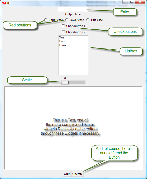
Each of the above widgets has its own place in user interfaces. Your first program used a Toplevel (created automatically to contain the application) and a Frame that contained two Buttons. In case you are curious about the appearance, here is a picture of a "kitchen sink" interface showing various widgets. By the look of the window, you can probably tell that the elements have been thrown together. Try and avoid this look at all cost.
So, the program you wrote above runs perfectly well, but the code is a bit to wordy. Each attribute of each widget is configured in a separate statement. If individual aspects of the widgets need to be configured at run-time, this might a convenient way to do it, but when you are creating a widget and many aspects need to be configured, there are better ways.
The most basic way to configure your widgets is with keyword arguments to the widget creation call. Rather than having to write self.QUIT["fg"] = "red" after you have created the button, you can add an argument reading fg="red" when you create the button. The same principle applies to most other widget configuration items. Try this out by modifying the tkdemo.py file as shown:
from tkinter import *

class Application(Frame):

    def say_hi(self):
        print("Hi there, everyone!")

    def createWidgets(self):
        self.hi_there = Button(self)
        self.hi_there["text"] = "Hello",
        self.hi_there["fg"]   = "blue"
        self.hi_there["command"] = self.say_hi
        self.hi_there.pack({"side": "left"})
        self.hi_there = Button(self, text="Hello", fg="blue", command=self.say_hi)
        self.hi_there.pack(side="left")

        self.QUIT = Button(self)
        self.QUIT["text"] = "Goodbye"
        self.QUIT["fg"]   = "red"
        self.QUIT["command"] =  self.quit
        self.QUIT.pack({"side": "left"})


        self.QUIT = Button(self, text="Goodbye", fg="red", command=self.quit)
        self.QUIT.pack(side="left")

    def __init__(self, master=None):
        Frame.__init__(self, master)
        self.pack()
        self.createWidgets()

root = Tk()
app = Application(master=root)
app.mainloop()
Run it. The window will have the same appearance and behavior as before, but you've compressed the code considerably without sacrificing readability.
Read over the code; you'll see that once the buttons have been created there's no
reference to them anywhere else in the code. So it isn't necessary to save a reference
to the buttons in instance attributes, and you could abbreviate the creation of the QUIT button even
further to this:
Button(self, text="Goodbye", fg="red", command=self.quit).pack(side="left")
But that might be taking things just a little too far. It's a judgment call. Remember, the
programmer who has to understand your code in six months might be you! Ask yourself whether
brevity is important enough to make your code that little bit harder to understand.
A third way to configure widget options is to call the widget's config() method with keyword arguments, naming the options you want to set and giving new values. This is sort of half-way between the two methods you have previously seen, which allows several post-creation changes to be combined into a single statement.
So far, we have used strings as the values of the pack() method's side parameter. Tkinter also provides named constants LEFT, RIGHT, BOTTOM, and TOP, which are easier to type and stand out more when you're reading the code. The module provides many similar values that make typing your code easier.
tkinter has many configuration options that you may find confusing at first. Most widgets have a keys() method that you can use to learn about the options you can configure. We'll try it out and see how it works. I bet you'll be surprised at how many options are available for configuration. Type the commands below in an interactive session as shown:
>>> from tkinter import *
>>> b = Button()
>>> for k in b.keys():
...     print(k)
...
activebackground
activeforeground
anchor
background
bd
bg
bitmap
borderwidth
command
compound
cursor
default
disabledforeground
fg
font
foreground
height
highlightbackground
highlightcolor
highlightthickness
image
justify
overrelief
padx
pady
relief
repeatdelay
repeatinterval
state
takefocus
text
textvariable
underline
width
wraplength
>>>
There are too many options to consider all of them in detail here (and many that you might never use, even after years of programming with tkinter), but we'll go over the ones you'll use most frequently:
| Item name | Definition |
|---|---|
| background, bg | The color of the body of the widget (on some operating systems, it's impossible to change the
background color of some widgets). The colors can be specified as strings (tkinter knows
about a lot of colors, and also accepts web-style RGB
values like "#006677"—you can read about them
here). You can generate
these from separate RGB values, where each element is an integer between 0 and 255, using code
like: tk_rgb = "#{0:02X}{1:02X}{2:02X}".format(128, 192, 200). If the RGB values are already in a list or tuple, you can use: tk_rgb = "#{0:02X}{1:02X}{2:02X}".format(*rgb) |
| foreground, fg | The color used to write inside the widget, encoded as described above. |
| padx, pady | The amount of padding to put around the widget, horizontally and vertically. Without this padding, the widget will be just large enough for its contents. |
| borderwidth | This creates a visible border around a widget. |
| height, width | Specify the height and the width of a widget (some widgets only let you set the width). Widgets with text in them use a height and width in text units; those containing graphics use a height and width in pixels. |
| disabledforeground | This specifies the foreground color to use when the widget is disabled (that is, when it has been configured not to interact with the user). Most interfaces use gray for disabled foregrounds. |
| state | The available states depend on the particular widget. The state can be "normal" (as the widget usually looks), "disabled" (how it looks when it won't interact with the user), "active" (how a button looks while the user is interacting with it) or "readonly" (for a Text or Entry widget with text that can be selected, but not changed, by the user). You can use the Tkinter constants NORMAL, DISABLED, and ACTIVE to represent state values as well. |
| Modern Python | For a more native look on each platform, the tkinter.ttk module provides
themed versions of many widgets: ttk.Button, ttk.Entry,
ttk.Radiobutton, and so on. You can mix classic and themed widgets freely; use
from tkinter import ttk and then refer to ttk.Button(...) in place of
Button(...). |
Now that you understand a bit more about the way GUIs are put together and the use of widgets, we'll try to use a couple of widgets in an example. We'll create a window that takes a text input and produces different results, depending on which of three radio buttons is selected.
We'll be looking at an interface with inputs—we'll have an Entry widget into which users can type text, and a set of Radiobutton widgets that determine which operation the program performs on the text entered, when the user clicks the Convert button.
For basic widgets like Entry items, you can usually read the item's value by calling its get() method, which returns the entered value.
More complex widgets like the Radiobutton can't be handled that way. Radiobuttons come in sets, and only one of them can be selected at a time, so you need to get a value from the set, not from an individual widget. In these cases, we use tkinter Variables; tkinter Variables are associated with widget values. Once the association is made, you can call the Variable's get() method instead of the widget's.
Variable types differ according to the type of values you will be extracting. Use a BooleanVar for simple yes/no choices, an IntVar for integers, a DoubleVar for floating-point numbers and a StringVar to retrieve text. Those last three are usually associated with an Entry widget, using the special textvariable configuration item.
At last, here's a program that actually does something!
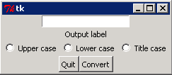
The next program is longer than previous examples, because it describes a more complicated interface. Two frames are used inside of the main frame. The first contains an Entry item where the user can enter text, a Label under it, and three Radiobuttons. The second frame holds the regular buttons.
The value of the Entry widget is read from the text configuration item, but the Radiobuttons are read using an associated IntVar, as integer values are associated with the choices.
Create texthandler.py and enter the code as shown:
from tkinter import *

class Application(Frame):
    """Application main window class."""

    def __init__(self, master=None):
        """Main frame initialization (mostly delegated)"""
        Frame.__init__(self, master)
        self.pack()
        self.createWidgets()

    def createWidgets(self):
        """Add all the widgets to the main frame."""

        top_frame = Frame(self)
        self.text_in = Entry(top_frame)

        self.label = Label(top_frame, text="Output label")
        self.text_in.pack()
        self.label.pack()
        self.r = IntVar()
        Radiobutton(top_frame, text="Upper case", variable=self.r, value=1).pack(side=LEFT)
        Radiobutton(top_frame, text="Lower case", variable=self.r, value=2).pack(side=LEFT)
        Radiobutton(top_frame, text="Title case", variable=self.r, value=3).pack(side=LEFT)
        top_frame.pack(side=TOP)

        bottom_frame = Frame(self)
        bottom_frame.pack(side=TOP)

        self.QUIT = Button(bottom_frame, text="Quit", command=self.quit)
        self.QUIT.pack(side=LEFT)

        self.handleb = Button(bottom_frame, text="Convert", command=self.handle)
        self.handleb.pack(side=LEFT)

    def handle(self):
        """Handle a click of the button by processing any text the
        user has placed in the Entry widget according to the selected
        radio button."""
        text = self.text_in.get()
        operation = self.r.get()
        if operation == 1:
            output = text.upper()
        elif operation == 2:
            output = text.lower()
        elif operation == 3:
            output  = text.title()
        else:
            output = "*******"
        self.label.config(text=output)

root = Tk()
app = Application(master=root)
app.mainloop()
Run it. You'll see a window that looks like the one shown below. If you click the Convert button before you select one of the RadioButtons, then the label text is filled with asterisks. If you make a choice, then the appropriate method is applied to the contents of the Entry widget, and displayed as the text of the label.
So, now you know something about creating GUIs. The code can get pretty lengthy, but it's relatively straightforward. In the next lesson we'll find out more about window layout, which will give us better control over the appearance of our windows.
A lot of the tkinter documentation offers code samples written in Python 2. Don't be afraid to get creative in adapting them to Python 3. Python 3 isn't really much different from Python 2 (although the package's name is capitalized in Python 2). I'm confident you'll be able to work out any necessary changes!
Your next port of call should be the Python documentation. The Tkinter Wiki is a community-maintained set of documentation that is informal and friendly to read. It's also user-editable and eternally incomplete; you may want to add your own insights later, as your expertise grows! Onward and forward to the next lesson!